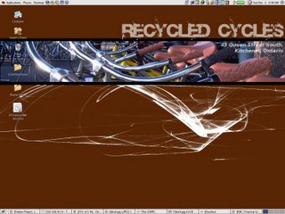
Truth told it was actually around 5am when I started working on the background for the screenshot you see on the left. Recycled Cycles is one of the programs at The Working Centre where people can come in and fix their bikes (by appointment), or come in and buy a bike at a very reasonable price. I created this image to help tie Recycled Cycles to the Computer Recycling program, which provides a similar service for computers. How does this all tie into Linux? Glad you asked! The quick answer is The Gimp.
The Gimp is THE Gnu Image Manipulation Program (GIMP). As the title implies, it's used for manipulating images. It's available on Linux and Windows platforms. Some compare it to Adobe PhotoShop, but PhotoShop is the king of image manipulation programs, and at its price it should be! The Gimp by comparison is FREE! While it might not be PhotoShop, it's certainly a capable program.
On to what you're probably most interested in, how did I create this image? First I started with a 1400x1050 background image, the brown with white whispy lines. Next I added a new layer. I made the new layer the active layer, and I used the box selection tool to select a rectangular strip across the whole image. Next I opened a 1400x1050 image of some bikes. Keep in mind this image is the same size as my original, so if I simply cut and paste the image, it would normally overlap my entire background image. But because I used the box selection tool, the only part of the image which showed was within the rectangular selection. I used the move tool to adjust the image so that it showed the handlebars, something I thought would look distinctively bikeish.
Careful observers will have noted that the pasted image floats above the new layer. Yes, so I merged it down into my layer (but I didn't merge that one with the background). My next step was to create the back lines at the top and bottom of my rectangular image to give it a more refined feel. Again, I created a new layer. Why another layer, why not just work on the same layer? Well, if you don't like the lines you can just delete the layer, leaving most of the rest of the image in tact. Otherwise you have to cut and paste, or undo a zillion times. Then I simply used the box selection and the fill tool to fill the smaller selection with black.
I used two more layers for the text. On both of the text layers I adjusted the Opacity of the layer, this gave the text a see-through feel. White was pretty dominant, creating see through text gave the text a less in your face feel. et, viola, finished image!
No comments:
Post a Comment